
Help Center / Revenue Forecasting
Revenue Forecasting
The firm's revenue curve, every project's trajectory, and the What-if against your target. · Managers · 7 min read
Two levels, one picture#
Forecasting reads at two levels. The Portfolio level is the whole firm: a KPI strip, the firm revenue curve, and a project list you can filter and group. Click any project to drill into the Project level: its own curve, its phase table, and its timeline, in a slide-out panel that keeps the portfolio live behind it.
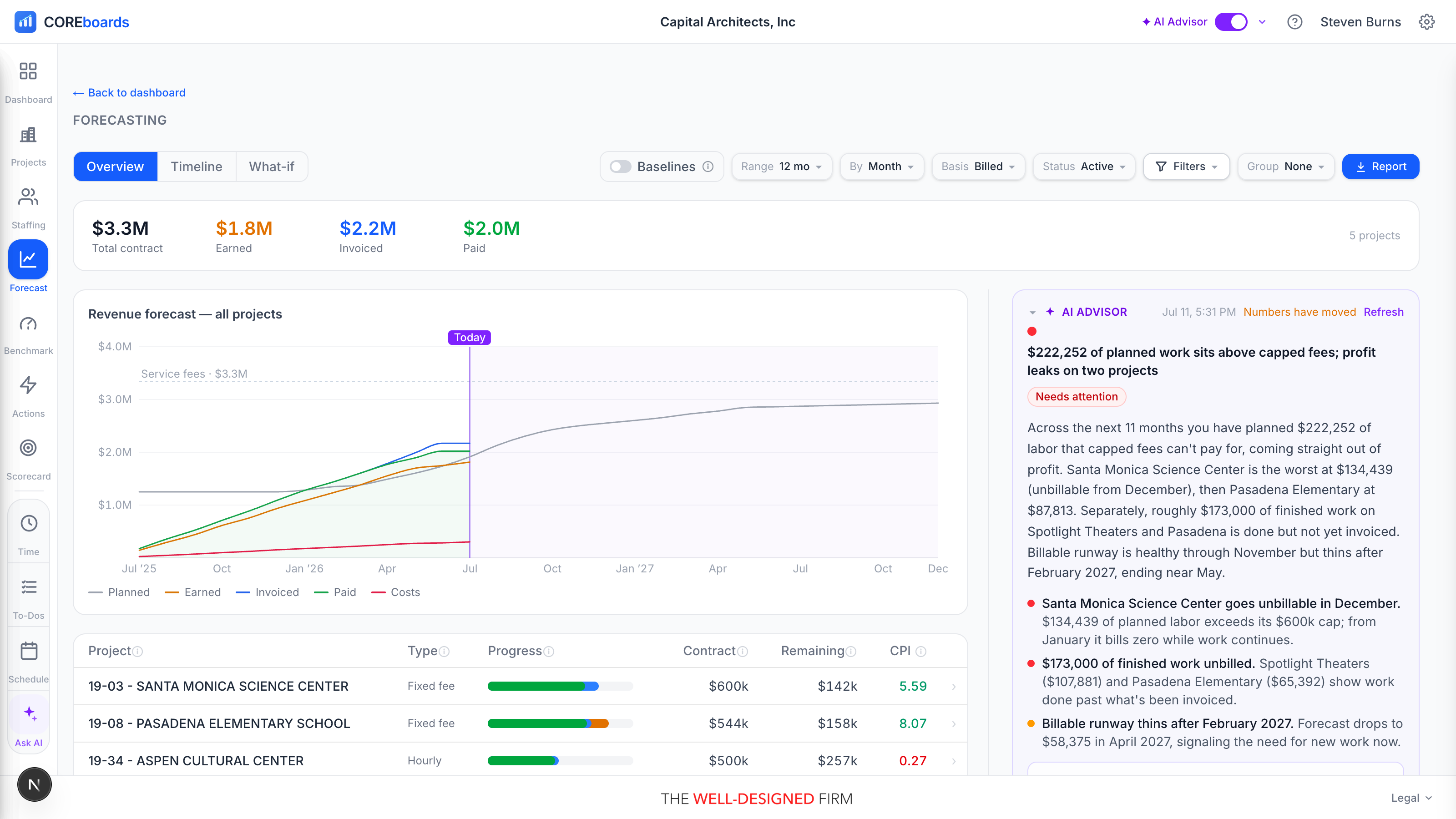
Three tabs share the same filters: Overview (curve plus project list), Timeline (a billed-vs-earned grid with a Gantt per project), and What-if (forward revenue against your target). Forecasting only reads; planning still happens on the Resource Allocation board.
The four stops: Contract, Earned, Invoiced, Paid#
Every dollar of fee moves through the same four stops, and the KPI strip, curve, and progress bars all speak this vocabulary:
- Contract: the fee you signed. The ceiling every other number is measured against.
- Earned: the value of work actually delivered, the % complete reported in CORE times the fee (not hours logged). This is progress in dollars.
- Invoiced: what you have billed clients so far.
- Paid: what has actually landed in the bank.
Billed vs earned, in plain English
Invoiced and Earned rarely match, and the gap is the story. Invoiced ahead of earned means clients have paid for work the team still owes: good for cash, but the labor is outstanding. Earned ahead of invoiced means you have delivered work you have not billed yet: revenue is sitting on the table. Hover a project's Remaining chip for its own plain-English read of the gap.
The firm revenue curve#
The Firm revenue curve stacks the four stops cumulatively, month by month: the planned S-curve out front, with Earned, Invoiced, and Paid climbing toward it. Where the lines spread apart is where money is stuck between stops.
- Firms that keep a Scoreboard get a baselines toggle above the curve: it overlays your monthly break-even (operating expenses from the monthly check-in) and profit target (the revenue that leaves your target margin), so you can see whether Paid revenue is clearing the bar.
- The Pursuits toggle above the curve draws a faint dashed line above the plan: the forecast if the work you are chasing lands. Only pursuits that carry a likelihood % count, and each counts at that percentage, so a $200k proposal at 50% lifts the line by $100k spread across its months. The solid plan never moves, and history never moves — the dashed line branches off at today. Set a pursuit's likelihood on the What-if tab.
- Hover any month for the exact figures; the same amber, blue, and green accents carry through the KPI strip and every progress bar, so the series read as one system.
Controls, filters, and presets#
- Range windows the curve and totals: 12 mo, 24 mo, YTD, or All.
- By switches the grain between Month and Quarter.
- Basis picks the progress yardstick: Billed (revenue you have invoiced) or Earned (contract value delivered). It drives the Progress and Remaining columns and the Timeline grid. What-if ignores it, since it measures confirmed forward revenue.
- Status shows Active projects only, or All including closed and inactive.
- Group reshapes the project list by Client, Project Manager, Principal, or Billable.
The Filter menu is the same one Resource Allocation uses, with the same dimensions, and it keeps its own saved presets for Forecasting. Build a view once (one studio, one client, one PM), save it as a preset, and it is waiting next visit.
The project list and the project drill-down#
The project list shows every Main Project with its Type, Progress, Contract, and Remaining (contract minus earned, or minus billed, per the basis toggle). Non-billable projects render grey and stay out of contract totals.
Click a row to open the project drill-down, a right slide-out you can drag wider:
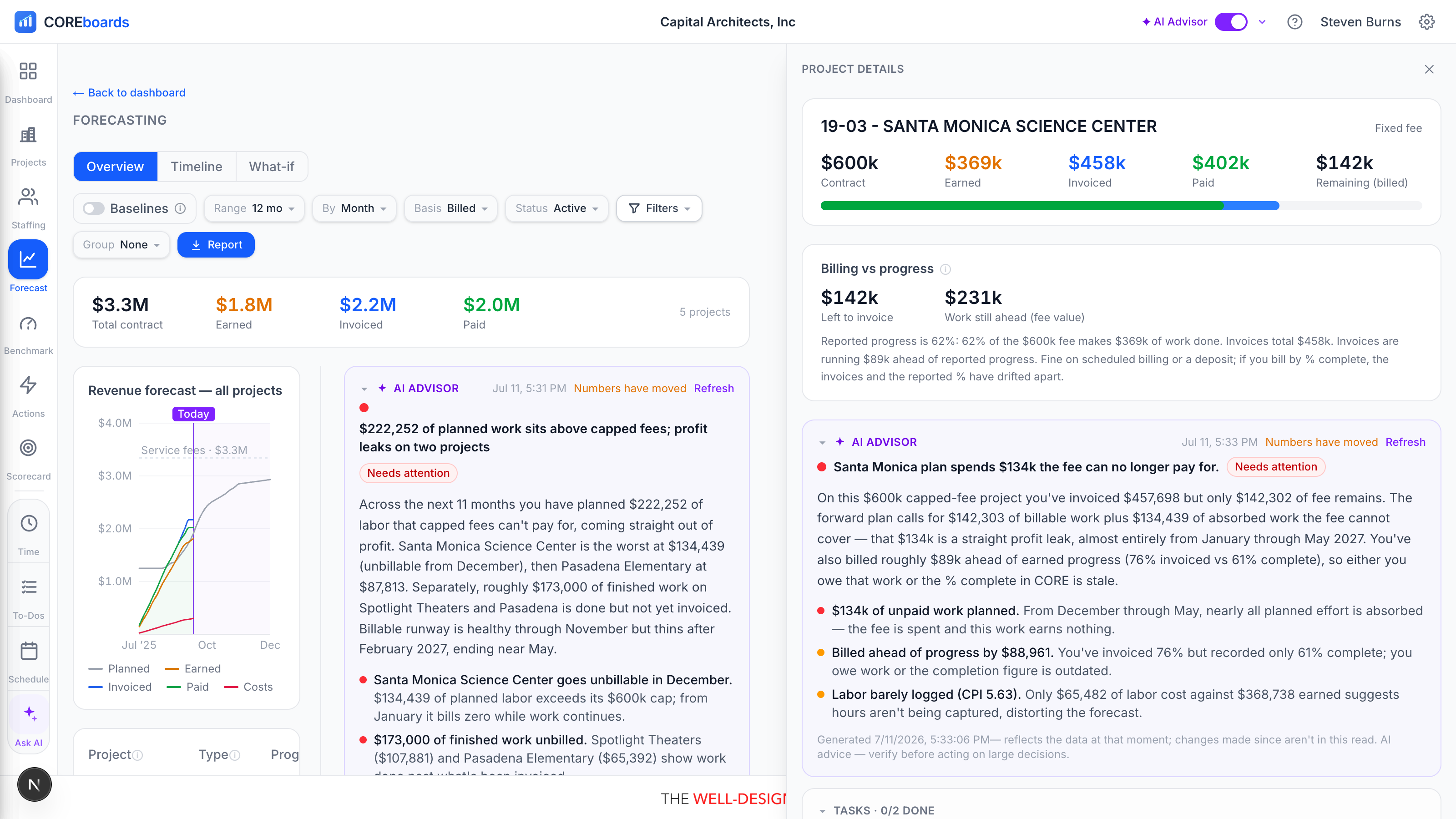
- The project's four-stop progress bar: Earned, Invoiced, and Paid nested against the contract ceiling.
- Its own revenue curve, the same S-curve read scoped to one project.
- The phase table, every phase in the contract in CORE's structure order, with each phase's fee and schedule.
- The phase Gantt, the project's phases laid out on the calendar.
- An earned value card where the data supports it: CPI and SPI, projected completion cost, and over/under fee, measured against the Contract or the CORE Budget.
The panel is not a pop-up dialog: the overview stays interactive behind it, and clicking another row swaps the project in place. Esc closes it.
The Timeline tab#
Timeline is the billing-vs-progress grid: every project and phase against the months, showing how invoicing tracks the fee over time, with the same Range, By, and Basis controls. It answers "are we billing this project on pace?" at a glance, and the firm-level header calls out how far invoicing runs ahead of (or behind) work done across everything shown.
What-if: forward revenue vs your target#
What-if prices the months ahead. Each bar is confirmed forward revenue: the staffing plan priced at bill rates and capped at each project's remaining contract, the same engine as the dashboard Forecast KPI, so the numbers agree everywhere.
- The dashed target line is your Scoreboard's Invoiced (total) annual target divided by 12, when your firm keeps one.
- Toggle tentative pursuits on and they ride each bar as a sketched ghost segment: solid is confirmed, dashed is maybe. The toggles share their state with the Resource Allocation board's Capacity lens, so the mix you test there is the mix priced here.
- When a pursuit's fee lands. A pursuit whose draft or estimate has a phase plan follows that plan. Otherwise its fee follows a typical project curve across its months: lighter at the start, heaviest before the middle, then a long thin tail at the end, never an even split. A CORE CRM opportunity takes its months from the Expected start and Duration set on it; CORE itself has no such fields. Without them the window is a guess, starting the month after the target date and sized from the fee, and the pursuit says dates guessed.
- Set the odds on a pursuit instead of treating it as all-or-nothing. Click the likelihood beside a pursuit (or set odds where it has none) and pick a percentage: at 50% the charts count half its hours and half its fee, so a far-off maybe stops swinging the whole forecast. A CORE CRM opportunity's odds are its win % in CORE: set them here and the opportunity and CORE change with them, as they do when you set them on the opportunity. A HubSpot deal arrives with its own probability; your figure for it is kept in COREboards and clear puts HubSpot's back. A CORE Hold or Draft project has none until you set one.
- Which projects are already in the baseline matters. The Status picker defaults to Active, so a Hold or Draft project is not in the confirmed bars — turn it on as a pursuit and it contributes in full. Switch Status to All and those projects join the baseline, so the same pursuit then adds only the part that is not already staffed, marked remainder only. Either way nothing is counted twice.
The sentences above the chart are the point: which months confirmed work covers, where the gaps are, and how much of the gap the pursuits would close if they land.
Can't find it? Email support, or use Bugs & Requests in the app's gear menu.